Project Scallop

This collection features a full deck redesign that I completed for a sales transaction. I addressed the challenge of cohesiveness by further developing the initial design template by doing my own brand research and pulling important graphics and shapes from the client's website. I emphasized dynamic shapes and color blocking to make it feel unique from other decks, but also consistent throughout. This does not include all Project Scallop slides but rather the most dynamic and representative of the brand. All logos, screenshots of client websites, and sensitive text has been wiped for confidentiality reasons.

Final Product
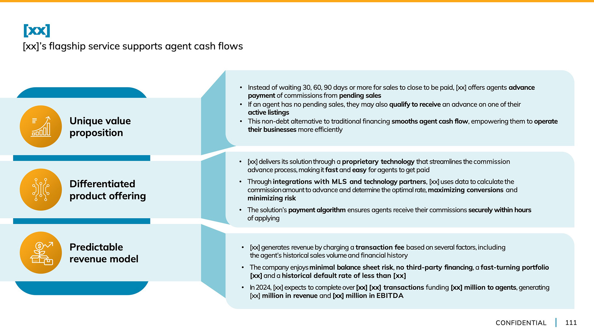
I used identical layouts for slides that conveyed similar information or were meant to be compared
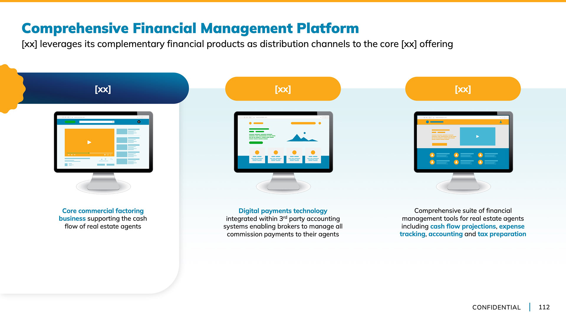
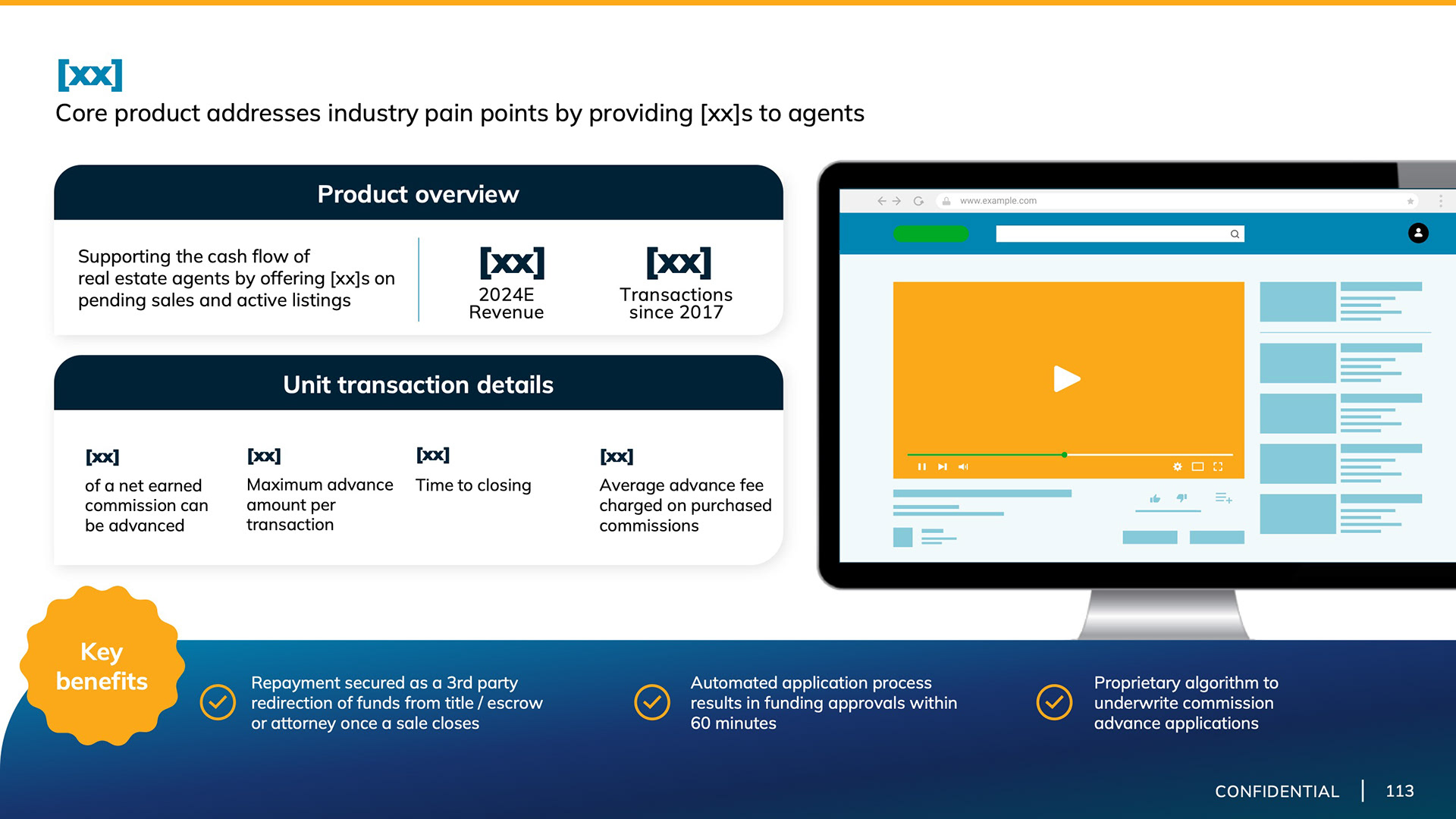
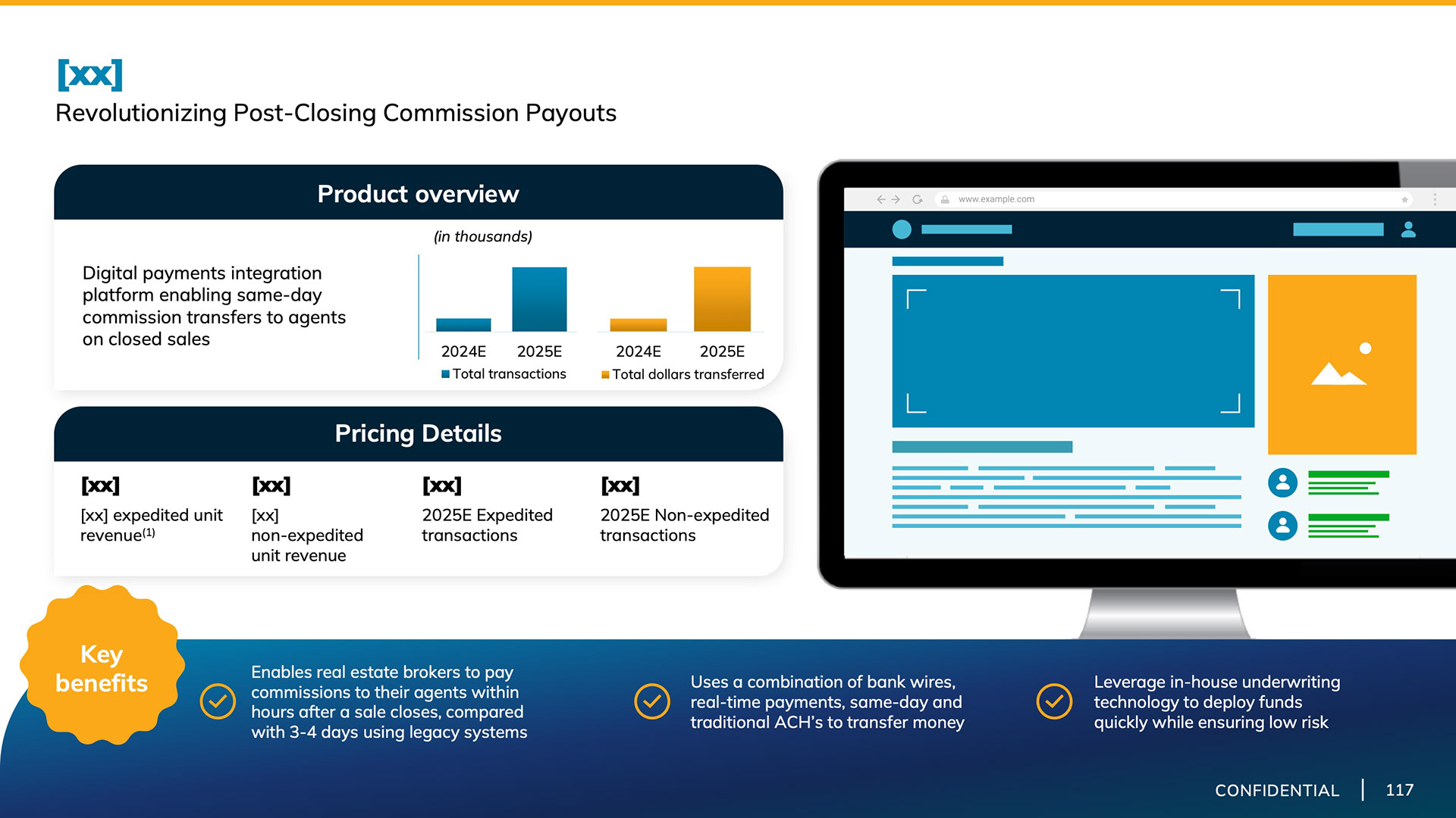
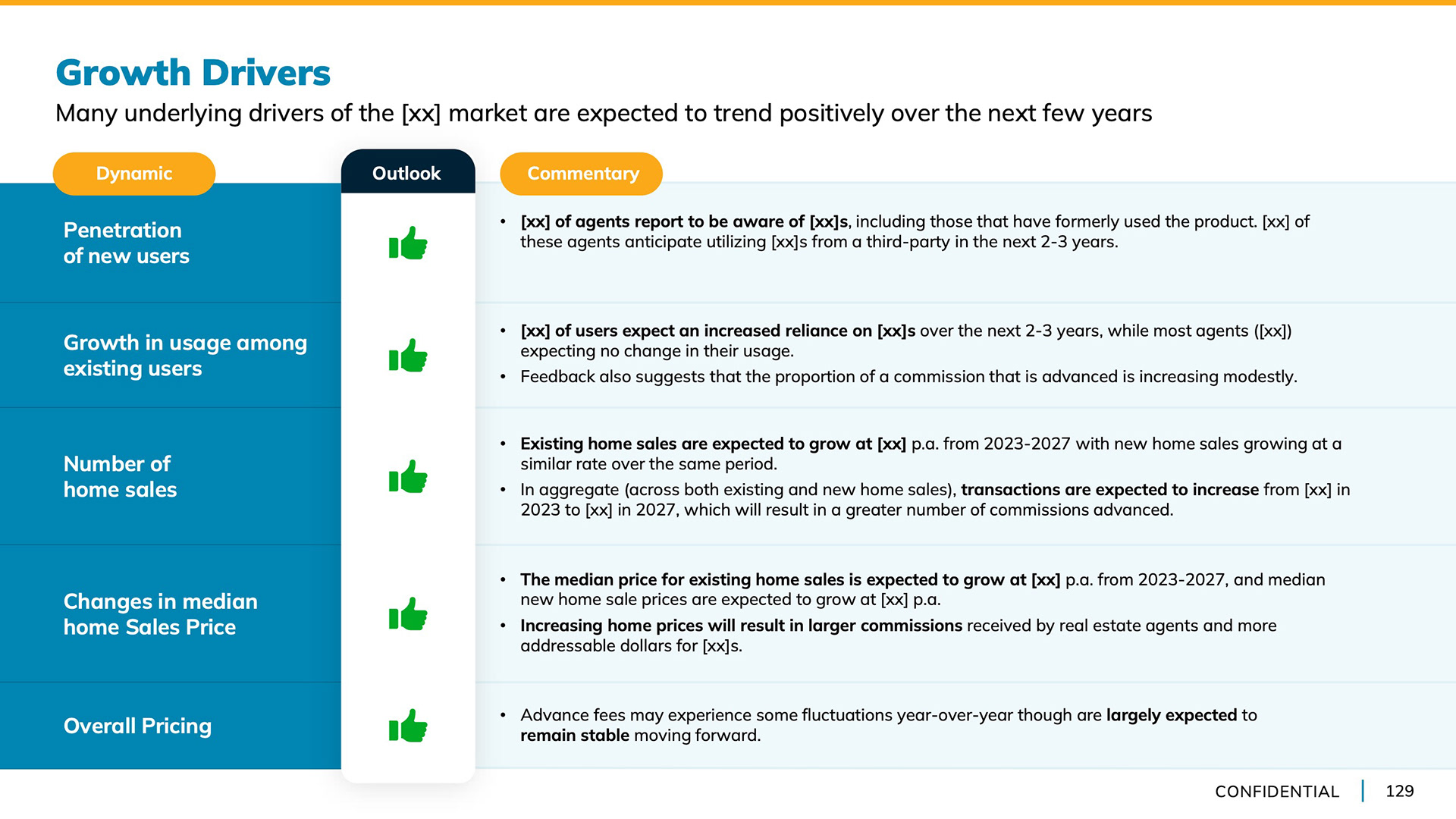
Brand shapes call attention to prioritized data and create a specific space for statistics. I also used smaller graphic elements, like the orange scalloped circle, as both a decorative element and header background.
I spent more time developing unique ways of presenting information with infographic charts that were different than what our team typically used to generate interest in the deck
Back to Top