Final Product & Strategy
These icons only include as much detail as necessary to be recognizable in form and action. The vertical layout of this poster lends itself to the motion of pouring ingredients into a cup, where the steps descend into the final product at the bottom of the page.
These icons only include as much detail as necessary to be recognizable in form and action. The vertical layout of this poster lends itself to the motion of pouring ingredients into a cup, where the steps descend into the final product at the bottom of the page.
Reasoning

Alignment
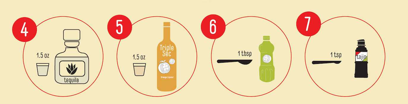
I used horizontal alignment to communicate steps that could occur simultaneously.
I used horizontal alignment to communicate steps that could occur simultaneously.

Color and alignment as tools to guide the eye
Colors
To distinguish different stages of production, I not only used position, but colors of the circles.
To distinguish different stages of production, I not only used position, but colors of the circles.