Content and Data Analysis
For her presentation, the Dean required data on many facets of the college. Once my team's data science expert had compiled raw data into Excel charts, I was tasked with 1) remaking a few of these charts in accordance with the Dean's edits and 2) placing them in a master document. After bringing all of the graphs together, I organized them by theme (graduate, undergraduate, etc) and spent time analyzing the data. I documented places where graph styles, numbers, and dates needed to be changed based on further meetings with the Dean, and most importantly, investigated the 'story' that comparisons between graphs told.

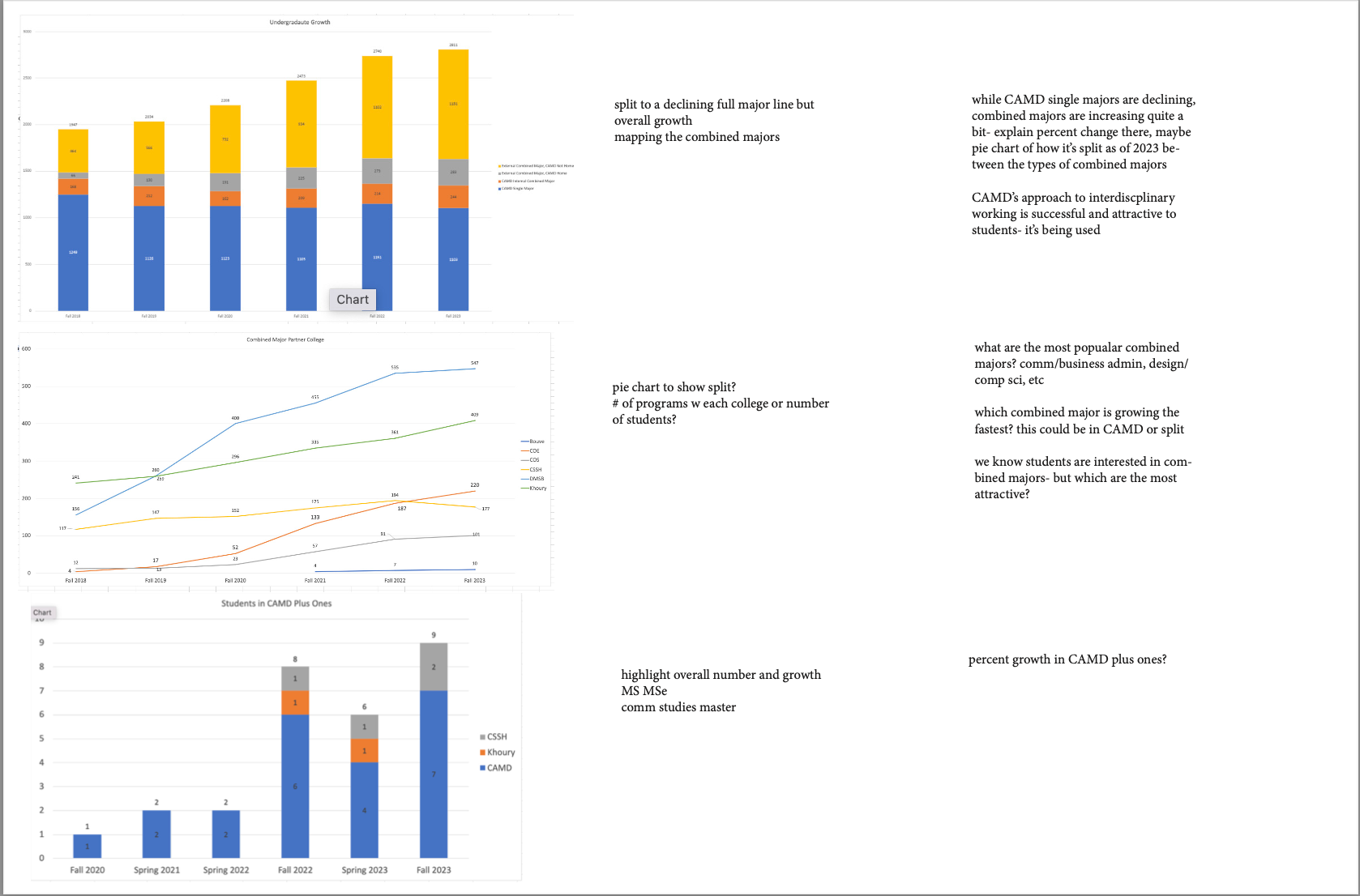
Illustrating stories and relationships between data points, not just pasting plain statistics and charts onto a sheet of paper

The 'stories'
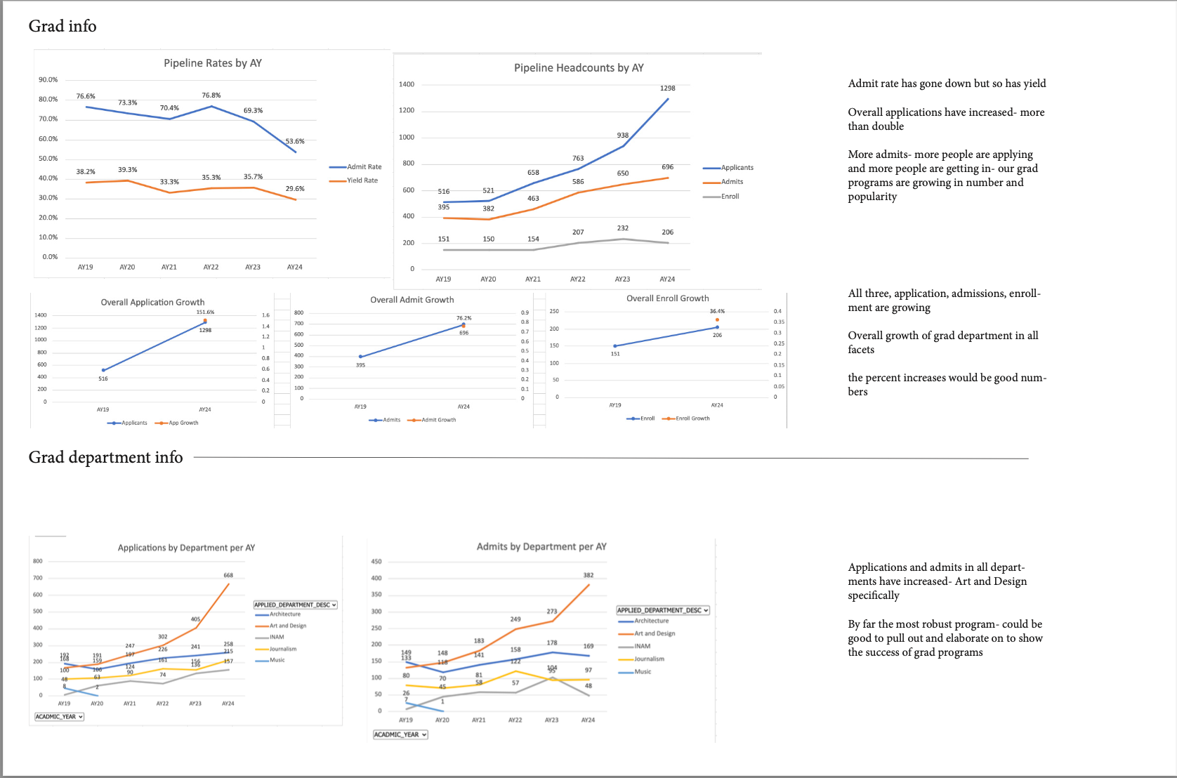
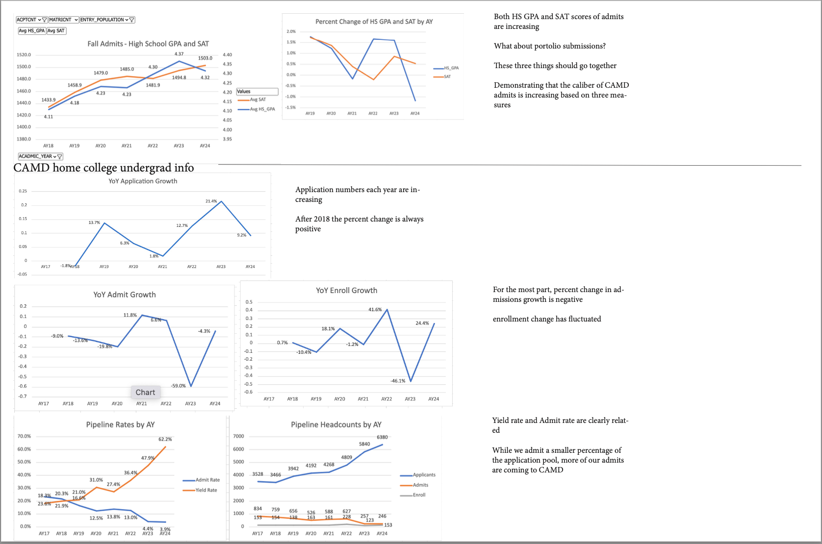
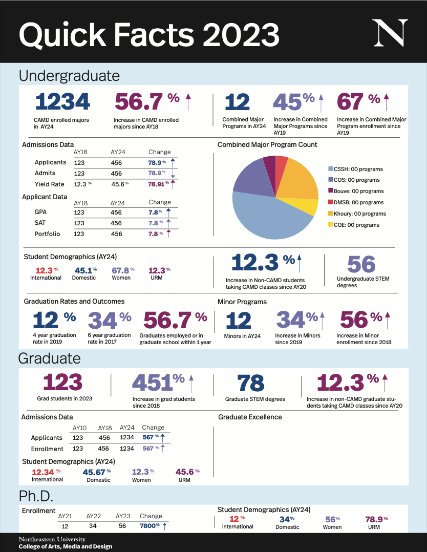
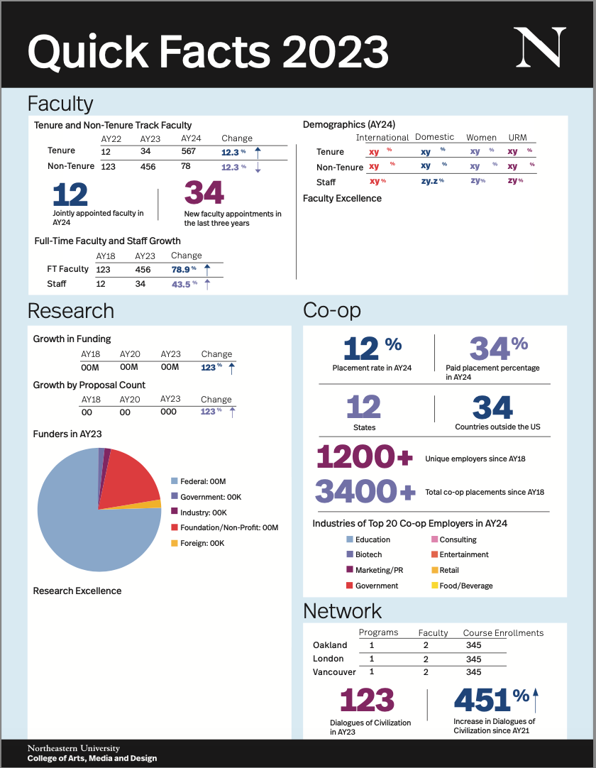
The Dean wanted her presentation to explain the relationship between various points. For example, in the document below, I found that while the CAMD acceptance rate has decreased, both the application and yield rate have increased, demonstrating CAMD's simultaneous growing prestige and desirability. As a CAMD student, I had a unique perspective when digesting this data.
The Dean wanted her presentation to explain the relationship between various points. For example, in the document below, I found that while the CAMD acceptance rate has decreased, both the application and yield rate have increased, demonstrating CAMD's simultaneous growing prestige and desirability. As a CAMD student, I had a unique perspective when digesting this data.
I added questions and notes into the Master Documents about how we could better display specific points (style of charts) and where it would be important to delve deeper into the data.
First Draft
Challenges and Edits
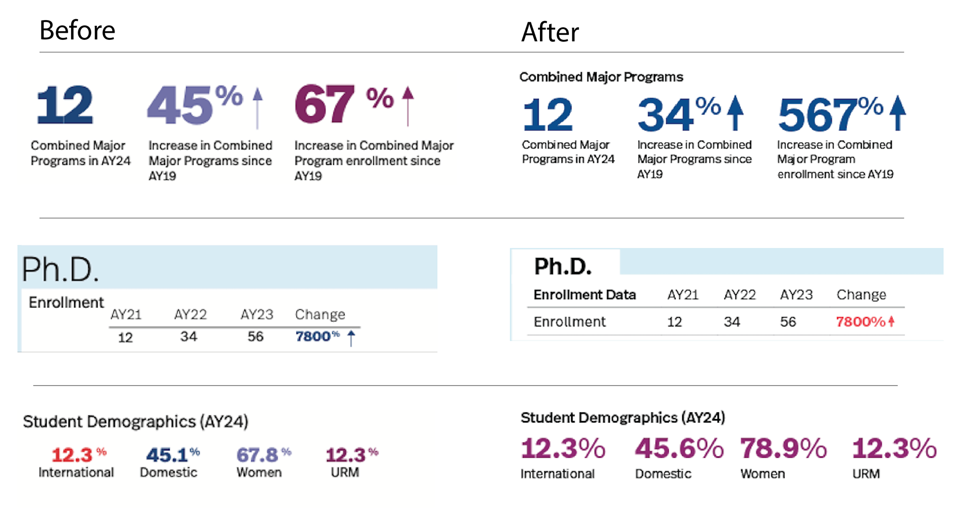
With the mass amounts of data being displayed, the document seemed chaotic, especially once I printed it out. To solve this, I had meetings with colleagues about both design and data issues.
With the mass amounts of data being displayed, the document seemed chaotic, especially once I printed it out. To solve this, I had meetings with colleagues about both design and data issues.
I began design changes by limiting my use of color, decreasing font sizes of the section and table titles, adding a white rectangle 'tag' for each title, increasing the size of percent signs and arrows, and decreasing the weight of the
larger numbers
larger numbers
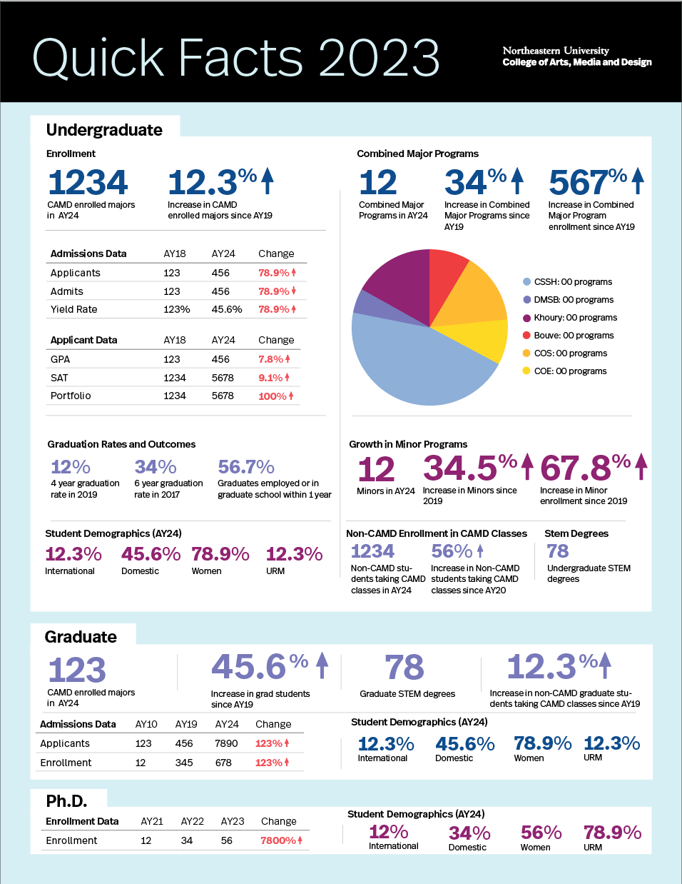
Final Draft