Final Product


I implemented a singular graphic element (the diamond) and created variables of it in different colors and as a 'tag' to help balance layouts and bring important information forward.


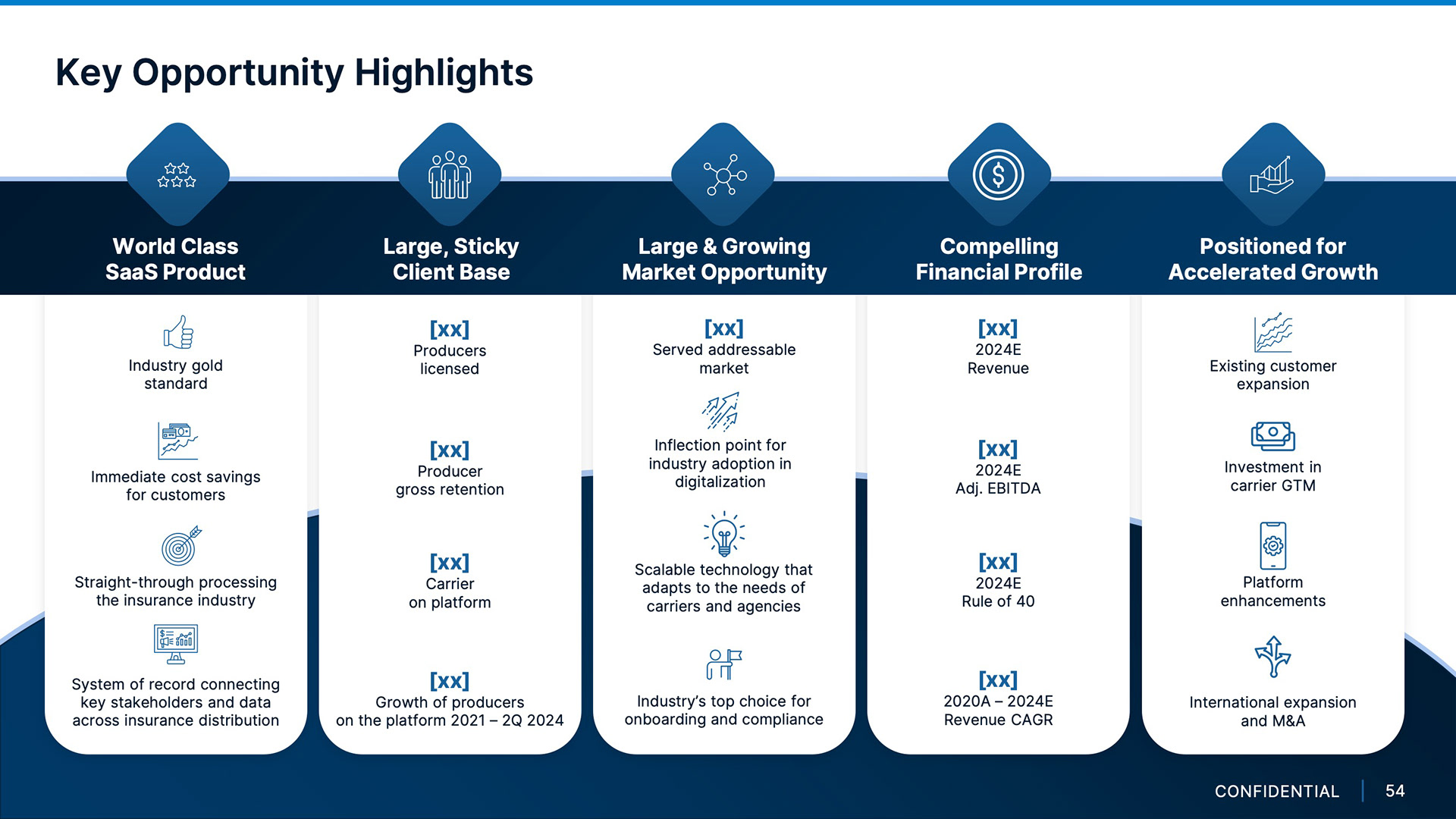
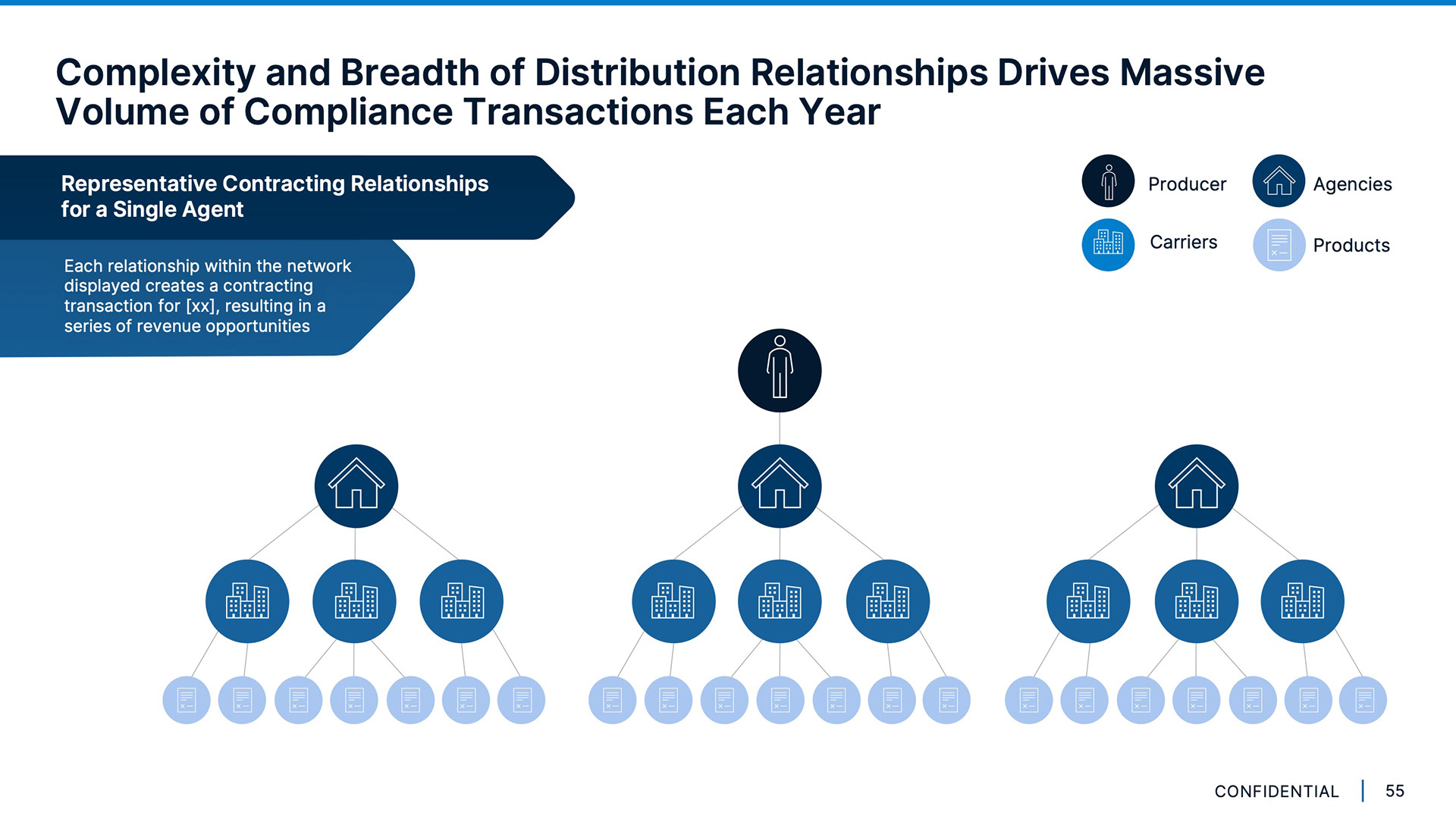


This deck redesign was an exercise in elevating a relatively bland brand. I solved this issue by developing small graphic elements to implement as ornamentation, layers, and color blocking throughout (I did this with permission from my managers, the analyst team, and the client). This does not include all Project Blue slides but rather the most dynamic and representative of the brand. All logos, screenshots of client websites, and sensitive text has been wiped for confidentiality reasons.