Final product & Strategy
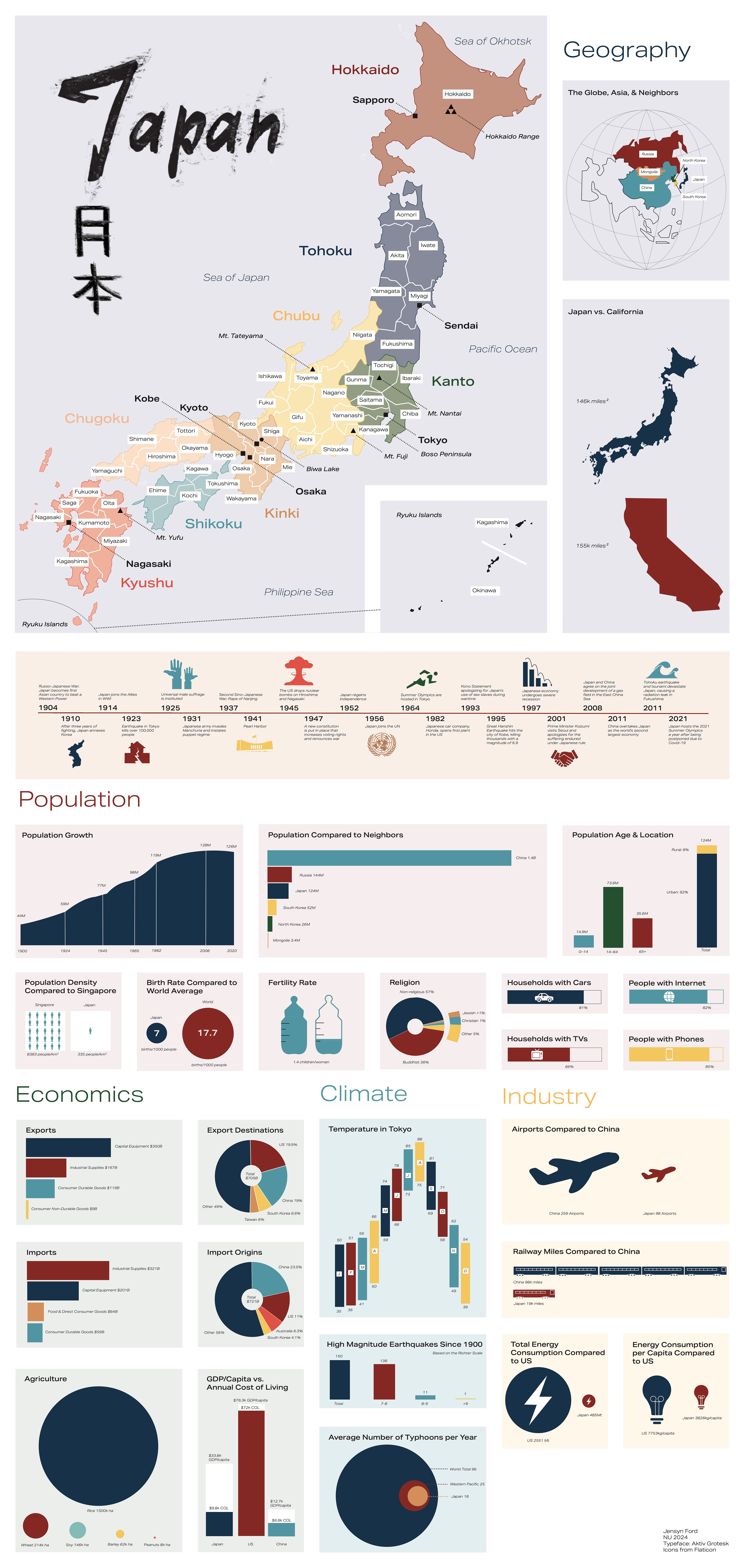
When designing a collection of diagrams, all presented simultaneously, I paid careful attention to embracing different types of charts and methods of depicting statistical relationships to incite visual intrigue and variance.
When designing a collection of diagrams, all presented simultaneously, I paid careful attention to embracing different types of charts and methods of depicting statistical relationships to incite visual intrigue and variance.
planning & Design decisions


Mapping and base design
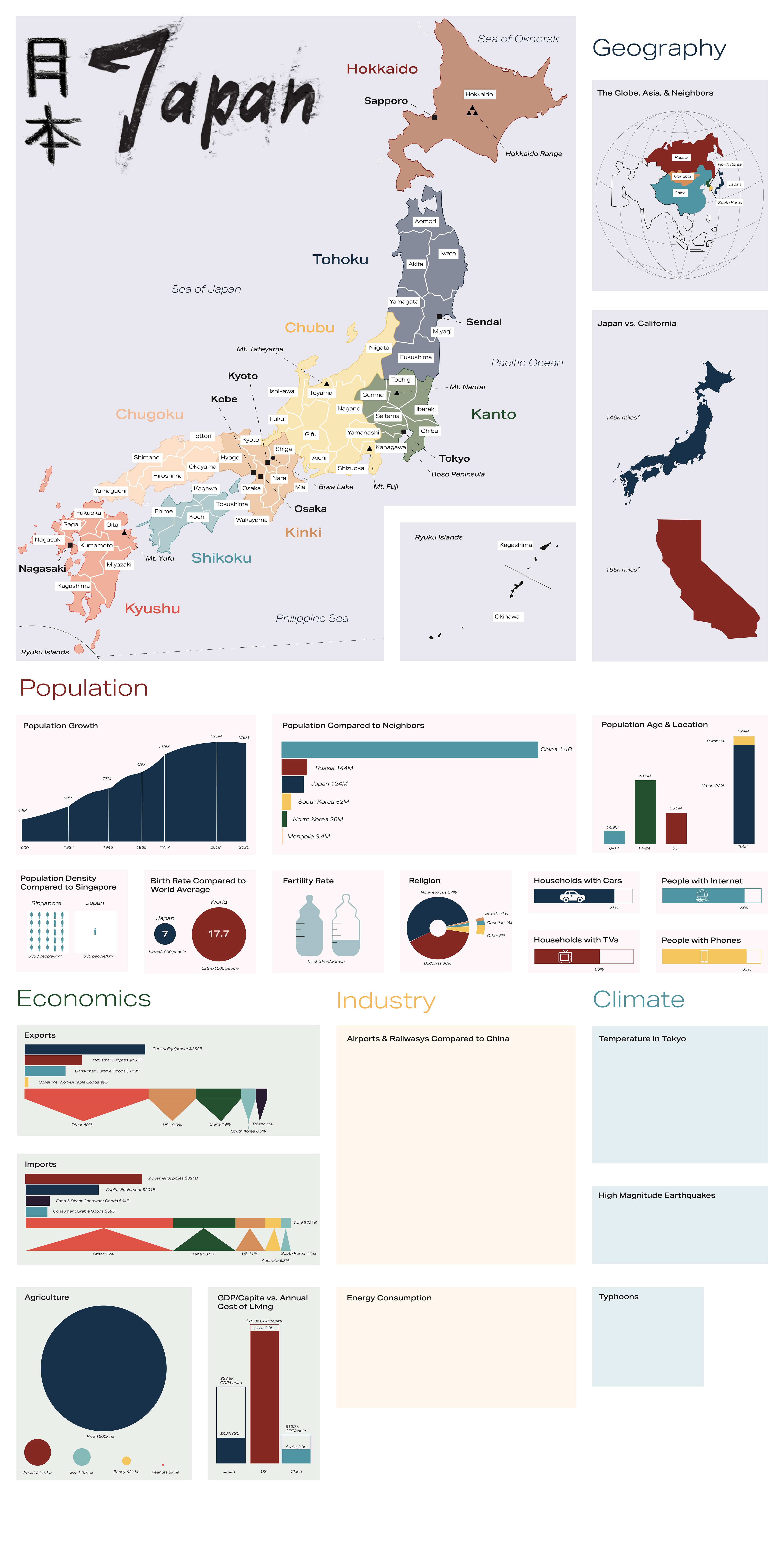
I started this project by blocking out a rough layout of my poster with each section. I then built my central map. After this, I began creating my charts in Illustrator. When determining which colors to use, I pulled inspiration from traditional Japanese design in the form of Kabuki Theatre posters.
I started this project by blocking out a rough layout of my poster with each section. I then built my central map. After this, I began creating my charts in Illustrator. When determining which colors to use, I pulled inspiration from traditional Japanese design in the form of Kabuki Theatre posters.
I invested in contrast between the calligraphic font of the title and the body text of the poster to visually represent both classical Japanese script, invoking traditional kanji, and a simple font to label the graphs and sections

Graph details

Zooming in
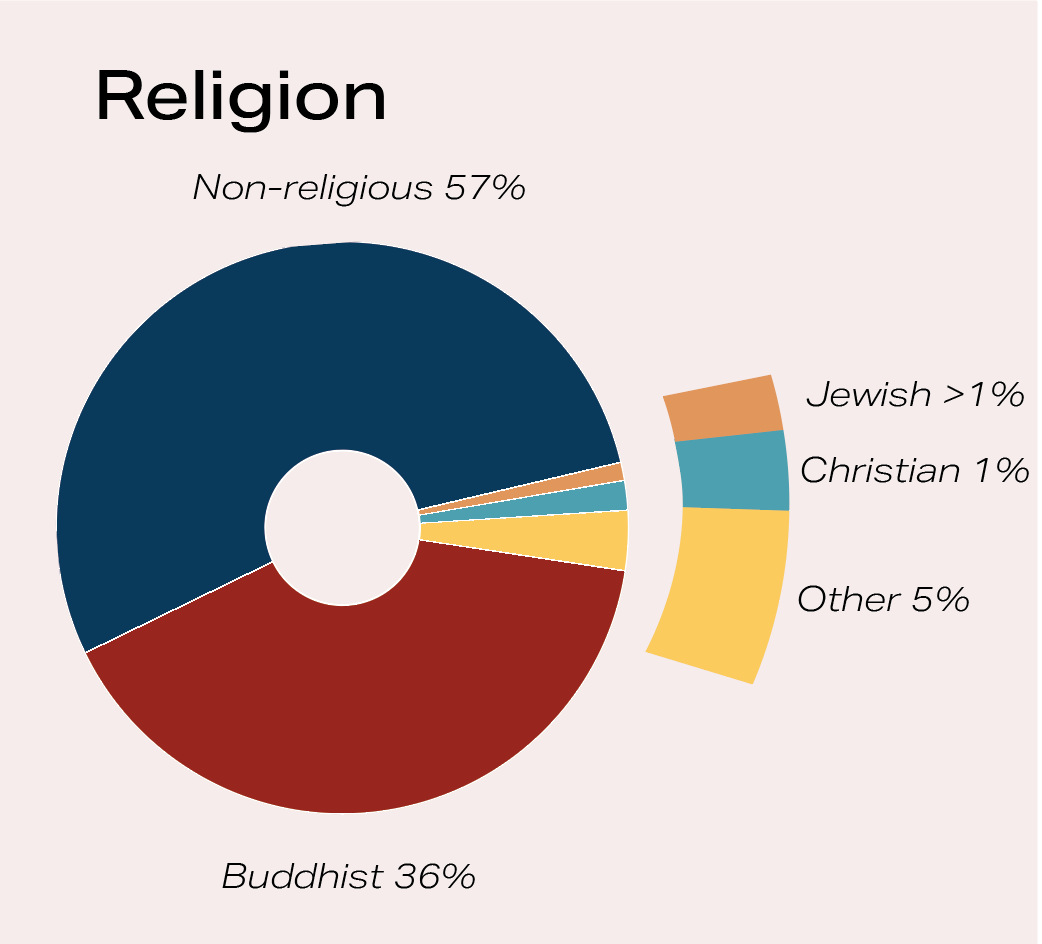
When confronted with data points of mere percentages, I knew that these small slivers would get washed away by the larger chunks in the pie chart. To solve this problem, I used a magnifying glass 'effect', pulling out the small pieces and enlarging them to ensure that they were equally visible
When confronted with data points of mere percentages, I knew that these small slivers would get washed away by the larger chunks in the pie chart. To solve this problem, I used a magnifying glass 'effect', pulling out the small pieces and enlarging them to ensure that they were equally visible
